Links
Tags
10 Things I Wish I Knew Upfront About Amazon RDS for SQL Server
Amazon RDS for SQL Server is Amazon's answer to managed SQL Server Instances in a similar vein to Azure SQL Managed Instance. You're provided with a functional SQL Server instance without the ability to log into the underlying servers. This makes it a great option for teams wanting to remove the routine patching and instance-style snapshots from their daily activities, however it also means many of your tips and tweaks you've learned as a SQL DBA over many years may no longer apply.
Amazon use several magic tricks to make the whole process work at the expense of masking or - if you're lucky - moving your typical DBA management style functions to new locations. If you've read the sales pitch about how RDS makes it easy to set up and operate, you might be forgiven to think this is a direct drop-in replacement ready within days or weeks at the latest and depending on your workload, you might be able to overlook some of what I'd consider 'missing features'. In fact, the Sales Pitch isn't wrong but I'd suggest that you really consider the impact of managing your own OS patching and SQL Server upgrades versus losing the ability to perform database backups your own way, or tweaking esoteric permissions, or even managing your system indexes and file placement. You're going to find out pretty early on that all that knowledge you learned from your time managing Self-Hosted SQL Server instances (in any capacity), needs to change:
- provisioning - hopefully you're doing this only once for Production.
- backups - this happens, just not the way any SQL Server DBA will expect it to happen.
- software patching - yes, majors are a request click away and minors can be automated or manually ordered.
- monitoring - for hardware failures yes, but this is very much a shared responsibility model.
- hardware scaling - the basics of any cloud or Virtual Machine tool really.
Don't get me wrong - you can create a reasonable platform within Amazon RDS for SQL Server - if responsibility for managing this particular instance is something you want to remove - or perhaps you're a team without a traditional DBA role already. But I'd also suggest if you're already managing a fleet of servers, an additional SQL Server isn't going to make any considerable change to their workloads - especially if you want to treat your SQL Server cluster as the 'holy grail' within the organisation.
1. Read the User Guide for SQL Server, and Read it Again.
Read. This. Guide. I'm definitely one of those that skims through documentation seeking things that may stick out as red flags - especially when there's so much of it 'scenario' driven (i.e. feature X doesn't work when RDS is configured this way, or workaround issue X by doing something that seems quite destructive and counterintuitive - we will get to those). I spent a little time upfront going through the Limitations section expecting I'd find out what areas to focus on and build workarounds for just by sticking to that section alone. What you don't get from that is the sense of how 'limited' a particular function will actually be for your workload.
While you're unlikely to remember everything from reading the guide, or be any clearer about how you're going to deploy this wild and untamed beast, you'll hopefully have trigger phrases ready to come back to when you go about diagnosing why things don't work. Make sure you also read through the Common DBA Tasks to get an idea of the scale of changes to your normal every day processes that will require testing and rework - everything from creating logins, users and assigning roles, through how your database automatically resolves a recovery type based on some semi-related parameters you set (this one caught me out by surprise when working with replication via DMS) and one of many limitations working in Multi AZ environments.
2. Backups and Restore Procedures.
You've read through the manual and probably didn't see anything about Backups except some loose references to importing / exporing data and a list of limitations much longer than the product itself, and Amazon RDS's overall backup strategy. Simply put, this is the weakest area of Amazon RDS for SQL Server.
First thing to note - you are not backing up the individual databases, you're snapshotting a fully functional instance with Point in Time Recovery capabilities. This is an important distinction that is difficult to explain to your powers that be who have never had to get in the weeds and recover data corruption. In fact, I don't think in my entire history of working with SQL Server I've ever found myself restoring a full instance from snapshot - or a production database in full. Typically, your production workload is still operational with corrupt data - so you attempt fixing data by writing queries to update bad data with good data.
To do this, you'd use Transaction Logs to restore a copy of the database to your specified Point in Time (via SSMS) and will begin either writing queries or using Data Compare tools to write expected data back to where it belongs. Depending on how big the database is, this is usually a several minute process especially when your database size is < 100GB, and Transaction Logs are available on the host. Obviously clustered environments will take longer with the Synchronisation process however it's typically a fast resolution if you know the time an issue occurred.
This leads to the second point. Amazon RDS for SQL Server does not support backing up Transaction Logs. You kind of have access to Differential logs, however the Instance Snapshots are apparently tied into making use of Transaction Logs meaning the chain can be broken if they did allow you access to them. So it makes sense why they are not available - but it doesn't make recovering Data Corruption kinds of disasters any easier.
To work around this, you may find yourself building processes that include restoring an instance to a Point in Time (you'll get a brand new host name and you'll need to update your firewall rules, IAM policies, Security Groups, etc...) - this will take some time to complete - ensure you do this without Multi AZ unless you want to double your restoration time. You'll then need to make a decision on how you're getting the database over to your existing instance. You could do this by using Native SQL Backups and Restores, and you could also do this via establishing Linked Servers or using some sort of Data Pump to get the relevant data over to your new platform. All of these will impact your RTO / RPO objectives, so it's important to Test, and Test again.
In case you needed to compress your native backups, you'll need to run a custom procedure to globally enable, run your procedure to do the backup and disable it later (assuming you don't want all backups to be compressed). I'm fine with compression for most tasks - but if you have governance and compliance reasons that you don't want to subject to possible CRC issues, then you'll want to be familiar with this.
I'd certainly recommend you come up with Run Books to help you perform this kind of action, because as you're going through the process - you'll find AWS isn't very good at telling you when you've made a mistake. Case in point - I started a restoration whereby I forgot to set the right Option Group - and I wasn't told until 90 minutes after I requested the restore to complete that the restore failed due to a missing option that wasn't available.
You may also find some strange behaviour in your testing whereby restores just Fail, so you're going to want to become well acquainted with your Premium Support providers in case this sort of behaviour happens in your critical production workloads. I must say, AWS have been pretty responsive in this department, but they do have SLA's you're going to want to be mindful of.
Finally, you may want to consider only having one database - or at most an application per instance. I realise this is a freakin' expensive way of doing it, however it is in line with AWS's one service per application model which removes much of the complexity in workarounds. This is a timely point to lead into the next issue...
3. Know your Costs - it's more expensive than you'd think!
Amazon RDS for SQL Server is expensive. Running a Multi AZ z1d.2xlarge SQL Server Enterprise instance with a modest 8 CPU / 64 GiB RAM footprint will set you back around $8 USD per hour before you add Provisioned IOPS, Automatic Snapshot Retention, SQL Native Backups and Data Transfer costs. Adding Read Replica's to this pool and you're talking over $10,000 USD per month.
Running EC2's doesn't make this a lot cheaper (cents in the dollar), however I would argue that running a larger cluster for all of your database requirements including adding separate instances gives you greater cost control when you have several applications to support (let alone the complexities you remove by having more of your databases in a single location).
It's also worth noting that for development environments, you cannot run SQL Server Developer Edition (licensing restrictions, as Amazon are running your environment) - so even in your Dev / Test environments, you're going to be paying for full SQL Server instances. You can run SQL Server Express if your application supports it, but it's hardly a good option if you need to profile your queries and other things typically involved with any sort of SQL query development.
If you're trying to remove the complexity of Server patching (which would ordinarily be done by your Server Engineering team anyway), and failover for SQL Server when doing so, it's worth comparing the limitations and workarounds to see if there really is a cost saving, if you're using largely the same staff to look after other workloads.
4. You're not really the DBA, Amazon is! And even then, they're automated bots.
This part cannot be understated. There's a gap between Amazon providing a managed service in the form of servers that can be automatically patched with some pretty smart AI behind it to do typical functions, however bots aren't particularly good at understanding the personality of particular workloads. For example, if a bot decides to increase your storage because it thinks your database is bigger than it really is - you may find yourself stuck like a Roomba that lost it's sight and continuously bashes itself into a wall. I've been in this situation and raised tickets with AWS only to confirm really that we really have to wait for the Bot to time out or work out what's wrong with your database.
Sometimes, you just need to pull the plug. If however you find your server stuck in a storage optimisation loop - you can't pull the plug or failover. That means that if your performance is pathetic, you have no levers to pull - except wait out the timeout loop with AWS. That's not to say they can't do specific things, but you're really at the mercy of someone who doesn't understand the characteristics of your workload and what kind of risk you may want to take - versus all their other customers.
Similarly, you're not the root user. At best, your a processadmin and setupadmin which affords you some rights to the server along with several esoteric grants and roles you're added to. If you're adding other users to 'administrate' the database, you're going to want to plan ahead for this. You may want to add Active Directory groups, Server Level roles and Database Level roles armed with scripts to add the necessary grants especially for your Dev / Test environments. You'll find yourself changing things slightly when it comes to managing SQLAgentUserRoles because you're heavily restricted in the msdb database. In any case, you're going to want to arm yourself with several scripts to make this process consistent and easy. I find myself writing lots of cursors and interrogating the database to copy permissions to several groups and it took several goes to get the right methods in the right place. Determine this upfront, or adding users individually to databases will become your destiny - and you don't want that in a cloud environment!
You don't have access to maintain System Indexes and Statistics. If you're an Ola Hallengren script user, you'll note that you probably have backups and regular maintenance jobs scheduled in SQL Agent jobs. You'll need to tweak these scripts to ensure you are building and running what you have access to.
Finally - ensure you know how to work with AWS Premium Support. I've faced many issues that I've needed explanations for - due to document clarity or undocumented 'features'. You don't want to find yourself in the middle of an incident only to realise that you have no levers to pull, because you're not aware of the limitations. You'll also need them to interrogate logs for you from time to time.
5. SSRS support is utter garbage.
SSRS and SSIS support have been added in the last 12 months to the RDS platform. I haven't looked into SSIS support, but understand there are several limitations around third party libraries and access to certain functions common among scripts we have in place. However, I had the unfortunate experience in working with SSRS.
Best to avoid this one if you use SSRS in any particular capacity. SSRS Portal does not support custom domains and yet it requires SSL. Because the certificate is self-signed, you'll find yourself finding the specific region and installing the Root CA onto your computer. If you've got a fleet of 2,000+ devices, you're going to be making Group Policy changes that would otherwise be unnecessary if you have a custom domain. To add to the problem, your users that may be used to visiting a URL such as https://reports/ would now need to remember https://your-database-id.your-account-random-characters.ap-region-no.rds.amazonaws.com:8443/ - that's a mouthful at the best of times. If you're using CloudFormation, you're not going to want to set an instance ID so you'll get strange characters like: https://abcd1234efgh5678.ijkl9012mnop.ap-southeast-2.rds.amazonaws.com:8443/ - easy right?
Even if you accept that madness, you'll then find yourself buried in esoteric stored procedures to add users to the portal. If you do this, they become Management users before you need to restrict access. You can't schedule reports to e-mail or store on a network share and the kicker - you can't use SSRS with Read Replicas in Multi AZ environments.
This one flabbergasts me the most that such an incomplete feature went GA. I'm not sure who would have a use case to use SSRS with the limitations above.
6. The perils of Multi AZ environments.
It stands to reason that if you're running mirrored databases that there will be some limitations to ensure integrity between your database instances. However, it would seem you have very limited options you can perform when running Multi AZ environments and some issues to sort out before going live. Things you will want to be aware of include:-
- You cannot rename a database.
- Your SQL Agent Jobs and Linked Servers are not replicated to your other server and you have no way of logging into the other server without performing a failover.
- You cannot restore DIFF backups (if you were thinking this would be a good stop gap solution to lack of Transaction Logs, this falls over here).
- Failover is not an immediate action - it takes around 40-50 seconds for a failover to occur. It's not bad, but if you need 100% uptime this may be a concern.
Most of these actions require you to convert your instance to a Single AZ, running the risk of an Availability Zone failure causing damage or outages to your database. And here's another kicker - you would also have to remove any Read Replicas you have set up prior to performing those actions as they only support Multi AZ modes.
Amazon provide a pretty comprehensive list of activities you're going to want workarounds for. I'd certainly recommend that you familiarise yourself with the list and test out scenarios that are quite destructive (i.e. removing Read Replicas, moving to Single AZ mode and back).
7. Available replication options - Read Replicas vs DMS.
This one was the biggest time sink for me. If you have a requirement on a Self-Managed SQL Server instance to provide a replicated data source for third parties to access, you might consider setting up a publisher and distribution model which comes out of the box with SQL Server. It's pretty easy to set up and data will replicate including all programmables over to the target.
It's not fool proof - it's still subject to the various integrity rules embedded in your database, but the advantage here is that you can access real-time data without impacting your primary database. You can add new indexes, tables, queries etc... and because it's on a separate instance - other users can create other databases on that server. It's dirty in my book to do this from a data integrity perspective, but it fits a niche data mining requirement.
First thing to note in Amazon RDS for SQL Server is that distributions are not supported so that rules out setting up this model (it can receive data, just not publish it). This leaves you with a few possible options.
Amazon provide a service called Data Migration Services and as the name implies, it's a tool used to migrate data from one data source to another. It's not a drop in replacement for replication, but it's purpose is to keep data in sync to help facilitate migrations from specific sources to destinations and can help with data transformations along the way. It's not a silver bullet though, and it's not magic. It's not aware of the esoteric nature of SQL Server and as such will not copy over your programmables, has various limitations around supported data types and in the time I used it, it wasn't particularly reliable.
In order to set DMS up, you'll find yourself performing a number of steps. The first SQL Option you'll need to add is MSDTC. This doesn't seem to have any material impact to performance but requires you to configure a non-default Option Group (you'll be doing this for Native Backups and SSRS anyway if you're using those). Once this was set up, a Full Replication task was created and managed to see a schema with data in it over at the target. Ongoing replication requires CDC to be enabled - to do this, it's not just a case of turning on the job, you'll need to enable CDC per table - which also introduces various tracking tables. So a capture job, configuration for polling interval, CDC stop and start underway, I interrogated the old INFORMATION_SCHEMA.TABLES for specific schemas and ignored system tables. I'd check if there's a Primary Key (or not) to appropriately set the @supports_net_changes flag in sys.sp_cdc_enable_table. Either way, it was a lot of ugly hacky-scripting to enable some kind of equivalent to the publisher / distributor model mentioned earlier.
Things kind of worked - at least the dashboard was demonstrating data migrating across and querying the other end certainly shown data being replicated. Unfortunately, it would 'fail' from time to time and completely stop transferring data due to validation. I couldn't really understand why either - the data in the Source was needed at the Destination. A few support tickets later, and no week where we went totally error free - it was time to pull the plug. To productionise this would require a way of sending over all Stored Procedures, Functions, etc... ignoring Foreign Keys (as even though CDC should guarantee transaction order, for some reason it wasn't).
One particular issue identified by AWS Premium Support via logs even pointed to the fact the database I was testing was in SIMPLE recovery mode. So back to Point #1 in this list - it completely slipped my mind that by disabling Automatic Snapshotting in AWS for our Dev Test environment, that I'd inadvertently disabled FULL RECOVERY mode. After a few more weeks of testing, we still had the same issues where CHECKSUM columns were not being calculated correctly and Foreign Keys would prove to be a problem for use in Power BI.
That leaves the second option which we are exploring via Read Replica's. The main challenge here is that we would be spinning up a dedicated instance such that our primary database will not have a performance penalty. We would also require SQL Server Enterprise Edition. The Read Replica works exactly as you'd expect with some hiccups along the way. I've already noted that you can't have SSRS enabled when you have Read Replica's enabled, but perhaps the biggest offender is that it won't run in Multi AZ mode. So if you are going to run Read Replica's, you'll need to keep in mind that you'll need to delete your Read Replica if you plan on moving back to Single AZ for any particular maintenance requirement. You will also find that your security (credentials and users) are copied across to your Read Replica as well - so segregating reporting style users from the Primary database may require some bespoke work too (you don't want your users accidently connecting to your primary instance!).
I'm still not sure that Amazon RDS for SQL Server really provides a good resolution for our replication scenarios. We wanted an OOTB experience rather than building curated sets of data - which is of course what we should be aiming for, but requires some dedicated work to get this sort of stuff right.
8. You can't do things while those AWS bots are doing things
You won't find this one out until you're in a hurry to do something. Let's say that you want to change an instance size for performance reasons, or perhaps you want to change some options on your server. Most of the time, this just works - that is until your Database Instance decides it wants to do a maintenance activity outside of the allocated window. I found myself several times fighting the RDS console trying to do anything - backups, restores, failovers, you name it because Amazon decided that Storage Optimization was required. Be aware of it, because you can't cancel the activity and if your database requires that maintenance urgently, there's not much you can do except wait it out. In one case, it took over 12 hours to optimise the storage volume from 500 GiB to 1,000 GiB. There was still some 400 GiB free and this seems to occur totally randomly.
9. Shrinking Data Storage Volumes if they auto-grow
Amazon RDS allows you to specify a Minimum and Maximum value to auto-grow of storage. This seems like a great way to set up parameters such as 500 GiB to start with, with auto-growth to say 2,000 GiB. Storage isn't hugely expensive - at $0.138 per GB, 500 GiB will set you back around $69 USD. But if your server finds itself auto-growing to 2,000 GiB, due to a bug in SQL Server reporting the wrong database storage size, you may find yourself auto-growing to 2,000 GiB and logs complaining that it can't grow further than that. So now you're paying $276 USD per month for storage you're not using, and didn't need - because of a bug.
You might think then that you can simply auto-shrink to reclaim that space (I'm not talking about database shrinking here - which for a whole host of reasons is inadvisable), but alas - no. You'll be building a new instance, dumping out a backup (remember that Native Option earlier? You're going to want that in place...) and unless you have the right provisions in place - you may induce downtime. If you're not using CloudFormation or other Infrastructure as Code tooling, you'll also find yourself updating IAM Policies (assuming you are doing the security thing!) and Route53 entries at a minimum if you have applications relying on hostnames existing.
Luckily this has only happened perhaps 3 times out of 30 provision and teardowns.
10. CloudFormation is incomplete.
This final item is not unique to Amazon RDS for SQL Server, but it's worth calling out. I started out by providing a series of nested CloudFormation templates and eventually moved them over to our CI / CD tool to run individually and take advantage of SSM to store known locations. For the most part, this process is awesome. The process builds S3 buckets, provisions IAM policies, provisions Option Groups, Parameters, Instances and runs a series of scripts to work through the limitations above (i.e. user role creation etc...).
But there are gaps. Amazon RDS for SQL Server does not support the creation of domain connected Replication instances via CloudFormation. Your immediate reaction may well be to ClickOps your way through the problem - after all, this will only occur once in Production.
For various reasons, especially in Multi AZ environments where you will be winding back Multi AZ to Single AZ for any notable changes requiring this, you'll want to have a set of templates and scripts that does this for you. If you don't, those policies, DNS entries, security groups, NCL's, and other components will all require manual manipulation or at least some crafty scripting to put them all back in place. At this point, there's probably an argument to say get onto Amazon CDK or another third party product Terraform, Pulumi perhaps?
Another issue to be mindful of was (and I can't remember how to replicate this one fully), I made a change to an instance type and wanted to make it Multi AZ. The reason you don't want to specify a Database Identifier in CloudFormation is reasonable - you may find yourself needing to build a new instance which will cascade down through your template and make the necessary adjustments. However, when this happened - CloudFormation did indeed snapshot the old instance, but it did not restore that instance to the newly provisioned instance. So I ended up losing the primary database, and had a blank, fresh new instance ready to go.
If you are using Infrastructure as Code as part of your process, you're going to want to tease out these sorts of changes to make sure come game day when you do need to make a change - you're not going to blast away your entire instance. The process itself may take an hour or two to complete, you don't then want to be kicking in your runbooks for restoring an instance from Snapshot adding further hours. That could turn into one mega-outage.
Final Thoughts...
If you're considering adding Amazon RDS for SQL Server to your stack, please take the time to understand the typical BAU activities that your DBA's conduct and ensure they are part of the journey. There are a lot of processes that need to change by adopting Managed Database Instances like this. Also be prepared for a lot of pushback. Those new to the product, having read the sales pitch and having gone through the pain of setting up clusters before may have high hopes for a platform such as this. It's a journey and perhaps the biggest struggle to showcase exactly where the limitations are and how they have real-world impacts to managing your application especially in the case of a disaster.
I'd suggest that if you're running Tier 2 / Tier 3 style applications (those that are not mission critical), then you may find that Amazon RDS for SQL Server is a reasonably adequate product, given the limitations to handle are perhaps less of a concern. However, managing Tier 1 applications with lots of variables and changes you may need to coordinate - I'd suggest that you may want to reconsider what you're trying to save as a result of using Amazon RDS for SQL Server over say running the EC2 variant in AWS.
In any case, it's fair to say that SQL Server in general is probably getting to it's used by date for new applications. As great of a product it has been over several decades - and certainly my most familiar RDBMS, the way we write and consume applications has changed. Perhaps those data mining activities of 10 years ago - while doable in an RDBMS might become part of the application itself, or you may want to invest in emerging technologies like Athena to help change the mindset that you must query specific resources a particular way. But also consider the staff you have. If their skill base is in SQL Server, moving to new platforms is not a silver bullet. Your team will need to 'want to' take it up - otherwise you'll create a bigger logistical nightmare to manage.
Cloud is complicated. There's more that can go wrong and you have to design for failure. As such, the comfort of a single environment with all the bells and whistles doesn't usually fit a highly available and scalable landscape. That sort of design is not for the fainthearted. There's a lot of leeway you get when you have total control of a stack - it allows you to write incredibly bad and unreliable code, reliably.
I would suggest that if you really want to adopt Cloud, you're going to want to take the serverless concept seriously. Work with asynchronous queues, write front-ends that are fault tolerant (i.e. never assume the connection is there, or that things are consistent), architect with state machines, queues and notifications in place and no longer rely on SQL Server (or any RDBMS for that matter) as your single source of truth. You may need to look at GraphQL databases, NoSQL databases and other tooling for storage. If you need to Glue that altogether, you can.
But it takes time, a lot of patience and I dare say you need a legacy team to keep the lights on while your second group work through a genuine shift in paradigm. You'll need the right skills and mindset to architect for failure scenarios - this isn't a skill that all people have and it's been particularly notable in legacy style developers.
I realise this last bit is a tangent, but it really sums up where cloud is advantageous, and where it's not. I struggle to see how the benefits of Amazon RDS for SQL Server pay off in an environment where you mix Self-Managed with Managed Services and I struggle to see why you'd only ever have Tier 2 and Tier 3 style applications in your environment. But alas - it's possible.
Building a Synchronised Christmas Lights to Music Display - Part 1
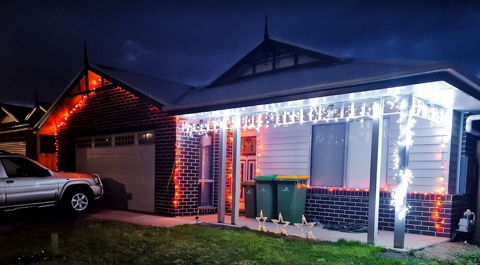
With only a couple more lockdowns to Christmas, it's time to get those gifts ready, plans organised and all that other stuff people do in the leadup. I used to despise people who'd start this far out from Christmas, but this year is a little different. My son last year (who is coincidently 1 year old today!) was mesmorised by some Christmas lights we put on the outside of our house last year. Nothing fancy - just some icicles and fairy lights from good ol' Bunnings. They did the blinky blink thing and he really enjoyed it.
No surprises that Covid-19 lockdowns have done a number on people looking for inspiration and last year it really shone through at least where I live with the sheer number of displays up compared to previous years. Some are quite impressive - entire houses covered in more fairy lights that would give Griswald a run for it's money. I'm also reminded of a display I saw a few years ago in the western part of Victoria that seemed to have some crazy Dubstep tunes pumping out to Christmas Lights. While it's not my choice of music, I can appreciate the effort that went into synchronising Arches to the bouncing beats.
I've always wanted to build a full-on Christmas display. I figure that with some programming talent, recent work on 3D printing and a few Raspberry Pi's and Arduinos, I should be able to build something similar albeit without all the Dubstep. Perhaps something a little more traditional and banter-ish.
Amazon sneakily recommended me some WS2811 lights and to make matters worse for me, they sealed the deal with a $5 coupon to go with it 😊. I figured at the very least I can start experimenting with a Raspberry Pi and turning these "NeoPixels" on and off individually.
In the meantime, I put my Google-Fu to good use and found some displays which looked interesting nearby but nothing out where I live in the eastern part of Victoria. I found the one in the western part of the state that I saw as well as another that had a large Mega Tree. There's just something not quite right to me though - don't get me wrong, it's a perfectly good display but not something that I could really see fitting my front yard.
That lead me to another forum (yes - active forums still exist apparently!) AusChristmasLighting. I must have spent 3, 4 maybe even 5 hours working through the Display Videos section - there were some pretty awesome synchronised displays there. With some YouTube-Fu, a guy by the name of Tom BetGeorge kept coming up and I eventually found the display and song that would inspire me now to build some props and try something simple. The music sequencing is near perfect in time to music, the banter the Trees have is fantastic - this is the sort of thing I'd been wanting to do for a while. It's amusing, kid friendly and has the right amount of joy for me that would make it worth doing.
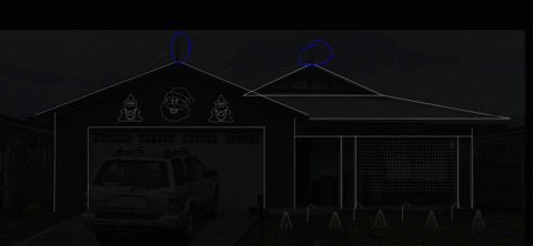
The forum I mentioned earlier - at first I didn't know it was an active forum until I started looking through the comments section of those videos. Definitely a treasure-trove full of advice (conflicting sometimes, but at least you get to hear lots of different opinions as this can get expensive very quickly if you make a mistake). The one consistent theme was a lot of praise for some free software written by an Aussie called xLights. On face value, it's sequencing is inspired by interfaces similar to FL Studio which I use a lot for sequencing music, and thought I'd jump right in and mock up a layout - see what this thing could do. It was fairly intuitive I've got to say. It doesn't look well organised when you first load it up on a 4K screen, but I was able to, having not read any manuals or watched any YouTube videos, roughly work out what to do. So much so that I had created my first rough layout.
Those Christmas Trees and Santa were part of what I would find out later to be a supplier of 'Coroplast' Christmas Props. I did have to wonder what kind of rock I'd been under to not realise this stuff was readily available but unfortunately shipping would prove to be a bit much and the sizing would not be compatible under the roof line - given the decorative elements already there.
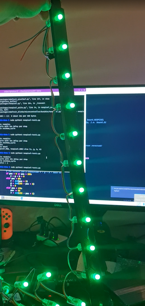
Those lights I ordered eventually arrived so I started sketching up a template that should fit the bulbs. The best way I find to work with 3D printing, especially when it comes to measuring up things is to take a measurement, but then put a hole slightly bigger in as well. Print a few test templates. I wrote a few lines of code using a Python library for WS2811 LEDs.
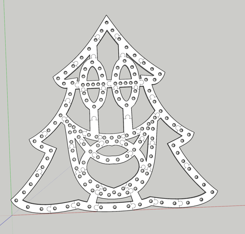
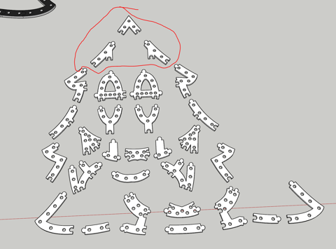
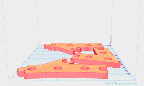
Great! The next step would be to climb up the side of the house and on the roof to get some measurements and think about custom designing some of these props. They would need to have a particular wiring order (configurable in xLights) and an appropriate size. Having drawn half a tree in Sketchup, I eyeballed the placement of the correct dimension for those bullet pixels. Once done, it was copied and flipped horizontally for symmetry and I began drawing Jigsaw lines in (I had experimented with a couple of joining techniques, this one works well for ABS at least. As you can tell, this isn't going to leave much room for error, but nothing a Mallet can't solve.
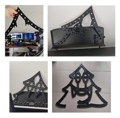
The print time would take around 5 days to complete. This method isn't perfect by any means. As it turns out, either the print diameter or the bulbs themselves are not identical meaning some fit well, some are too loose and some are too tight. Also, the eye balling of bullet placement should have taken into consideration strings of 50 to avoid lots of cutting, splicing and soldering. If I were to do this again, I'd probably more densely pack pixels and perhaps shape up more of a mouth to get it to 200 pixels and look to more evenly space the pixels including changing the hole design so the bulbs "clip" in rather than hard pressed. So while not perfect, the dimensions will certainly fit within the desired space.
With all the bulbs pushed in using a tool from this guy (which I should have found before I started, it would have saved my hands a significant number of cuts not too dissimilar to 90s era PCs), it was time to fire up xLights, and an OS for the Raspberry Pi called Falcon Player. Having connected the 12V string of 156 bulbs to the Raspberry Pi and injecting some 12V 5A into the string, and a face singing a song, well... here is the result (albeit with a bulb or two that requires better remapping).
There has been a lot of progress in the last few weeks on this including the Mini Tree, Santa and Candy Cane. I'm still yet to determine how i'll complete a Matrix, but I've got some ideas using some PVC Conduit and some 3D Printed templates to drill in. I'm also waiting on some WS2812B LED Strips to come in from AliExpress to do the house outline with. I've also sequenced a couple of songs already to get the hang of xLights (hint: there are a tonne of YouTube videos explaining concepts to help you accelerate your way to creating effects). Those will certainly be a bit of fun to work with when the time comes, but none the less this year's Christmas display is shaping up to be something awesome.
